Why Responsive Website Design Matters for Small Businesses in Lancashire
When I started working with small businesses in Burnley a few years ago, one of the first things I noticed was how many of them had a website that looked great on a desktop monitor but fell apart on a phone. A customer would pull out their mobile to check opening times, and the text would be tiny, buttons would overlap, and the whole thing would take forever to load. That is not just frustrating for the visitor. It costs the business real money.
For a Lancashire business, especially one relying on local footfall or enquiries through a contact form, the quality of that mobile experience can make the difference between a new customer and a lost opportunity. That is where responsive website design comes in. It is not a luxury anymore. It is the baseline for any serious online presence.
What Responsive Website Design Actually Means
Responsive website design is a way of building a site so that its layout, images, and text adapt automatically to whatever screen size the visitor is using. Instead of maintaining separate mobile and desktop versions, you have one set of code that flexes and reflows. The core technologies behind this are HTML5 for structure, CSS3 for styling and layout rules, and JavaScript for interactive behaviour. Together, they let you define a responsive grid, use media queries to apply different styles at different screen widths, and include a viewport meta tag in the head of every page so the browser knows how to scale the content.
Without that viewport meta tag, a phone will try to render the page as if it were a desktop screen, shrinking everything down to postage-stamp size. That single line of code is small, but skipping it is one of the most common mistakes I still see in older sites.
Mobile-First Thinking and User Experience
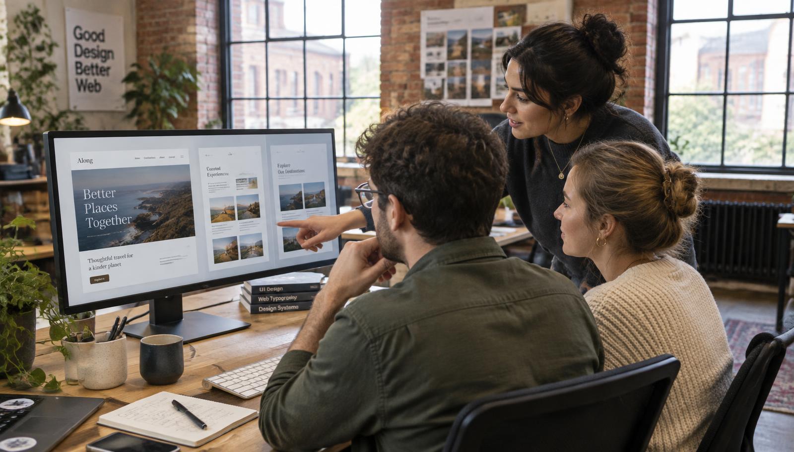
These days, most web traffic in the UK comes from mobile devices. That means if you are not designing with mobile-first principles, you are actively making it harder for your audience to engage with you. Mobile-first does not mean ignoring desktop users. It means starting with the constraints and opportunities of a small screen and then scaling up. That approach naturally leads to cleaner layouts, faster load times, and a better overall user experience.
User experience is not just about aesthetics. It is about whether someone can find what they need without hunting. For a small business web design project, that might mean making sure the phone number is tappable, the menu is touch-friendly navigation that does not require pixel-perfect aim, and the contact form does not demand typing on a tiny keyboard for five minutes. Every friction point you remove makes it more likely that a visitor will stay, explore, and eventually convert.
Conversion Rate Optimisation Starts on Mobile
Conversion rate optimisation is a term that sounds technical, but it really just means making it easier for people to do what you want them to do on your site. For a Burnley-based shop or service business, that might be filling out a quote form, calling you, or buying a product. If your site is not responsive, those conversions drop off sharply on mobile. People do not have the patience to pinch-zoom and scroll sideways.
I worked with a local retailer who had a WooCommerce store built a few years ago. Their e-commerce checkout was a nightmare on phones. The dropdown menus were tiny, the payment button sat off-screen, and the cart page reflowed badly. After we rebuilt the site with a responsive approach, their mobile conversion rate doubled within two months. That is the difference between a site that frustrates and one that sells.
Performance Matters: Google PageSpeed and Accelerated Mobile Pages
Responsive website design also affects how fast your pages load. Google PageSpeed is a tool that measures that speed, and it directly influences your search rankings. If your site is slow on mobile, you will rank lower, even if your content is great. Accelerated mobile pages, sometimes called AMP, can help with certain types of content, but a well-coded responsive site is often enough for most small business sites. The key is to keep your CSS3 lean, optimise your images, and avoid heavy scripts that block rendering.
One practical tip I give to Lancashire business owners is to test their own site on a phone using a 4G connection. Not on Wi-Fi. Real-world mobile data speeds are slower. If your site takes more than three seconds to load, you are losing visitors. A responsive grid that stacks content vertically instead of forcing horizontal scroll helps here, because the browser can start rendering the visible content first without waiting for the entire page to download.
Local Search Engine Optimisation and Responsive Design
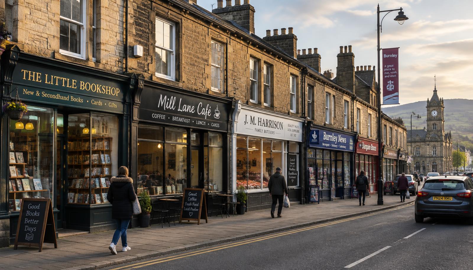
For a business that relies on local customers, local search engine optimisation is critical. Google now uses mobile-friendliness as a ranking factor in its local search results. If your site is not responsive, you are less likely to appear in the local pack when someone searches for your type of business in Burnley or the surrounding area. That means fewer phone calls, fewer directions requests, and fewer walk-ins.
Responsive design helps local SEO in another way too. When your site is responsive, you have one URL for each page, not separate mobile and desktop versions. That consolidates your link equity and makes it easier for Google to crawl and index your content. It also simplifies social sharing, because people are not landing on a broken mobile version when they click a link from Facebook or Instagram.
Practical Considerations for Small Business Web Design
If you are planning a new site or a redesign, here are a few things to keep in mind:
- Start with a mobile-first wireframe. Sketch out how the homepage, about page, and contact page will look on a 320-pixel-wide screen before you think about the desktop layout.
- Use media queries to adjust font sizes, spacing, and column counts at common breakpoints. Do not assume one layout fits all screen sizes.
- Test touch-friendly navigation. Make sure menu items are large enough to tap with a thumb and that dropdowns do not require hovering, because there is no hover on a touchscreen.
One mistake I see often is designers trying to squeeze every desktop element onto the mobile view. That does not work. You have to make decisions about what is truly important. A responsive approach forces you to prioritise content, and that usually improves the user experience for everyone, not just mobile visitors.
Choosing the Right Platform
For many small businesses in Lancashire, WordPress combined with WooCommerce offers a solid foundation for a responsive site. WordPress has a huge library of responsive themes, and WooCommerce handles the e-commerce checkout reliably if you set it up with mobile users in mind. The trick is to avoid bloated themes that pack in every feature imaginable. A clean, lightweight theme that uses HTML5 and CSS3 well will almost always outperform a heavy multipurpose theme.

Custom development is sometimes worth it, especially if your business has unique functionality needs. But for most local businesses, a well-chosen responsive theme with thoughtful customisation is enough to deliver an SEO-friendly website that works across devices. The phrase responsive website design gets thrown around a lot, but in practice it means making deliberate choices about layout, performance, and usability for real people using real devices.
Final Thoughts
Building a responsive site is not a one-time project. You have to maintain it. New screen sizes appear, browsers update, and your own content changes. But the investment pays for itself through better search rankings, higher conversion rates, and a stronger connection with your local audience. For a Lancashire business, especially one in a competitive market like Burnley, having a site that works well on every device is one of the smartest things you can do. It shows customers that you care about their experience, and that is the kind of trust that turns a one-time visitor into a loyal customer.